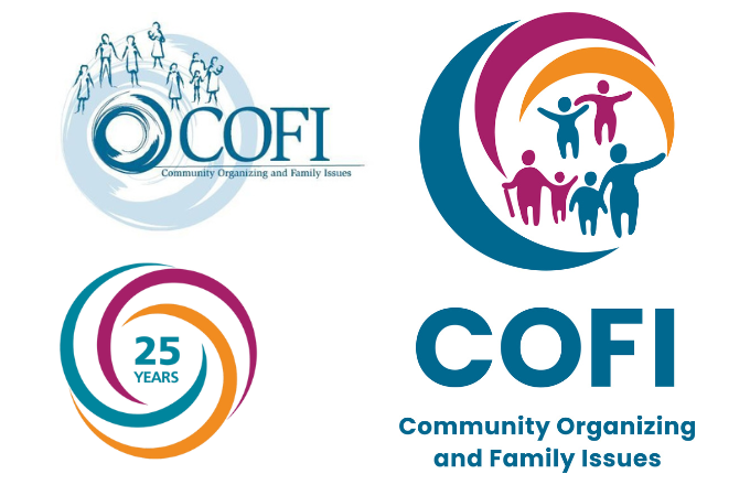
Since turning 25 in 2020, COFI has continued to grow by leaps and bounds – in part due to the COFI community’s unwavering support over the years. To help usher in the next 25 years and beyond, we are so excited to share our brand-new logo:

In the new logo, three dynamic crescents, which represent the three phases of The COFI Way, join seamlessly to form a circle. Within this inclusive space, families are united in community and action. The circle, conveying togetherness and unity, is open because all are welcome. The bright colors evoke vibrancy and fresh perspectives parent leaders bring to the table. Lastly, the recurring elements in all three of COFI’s logo speak to our long history and trusted reputation.
We also refreshed the POWER-PAC IL logo with a new color scheme to match, highlighting the strong partnership between POWER-PAC IL and COFI.

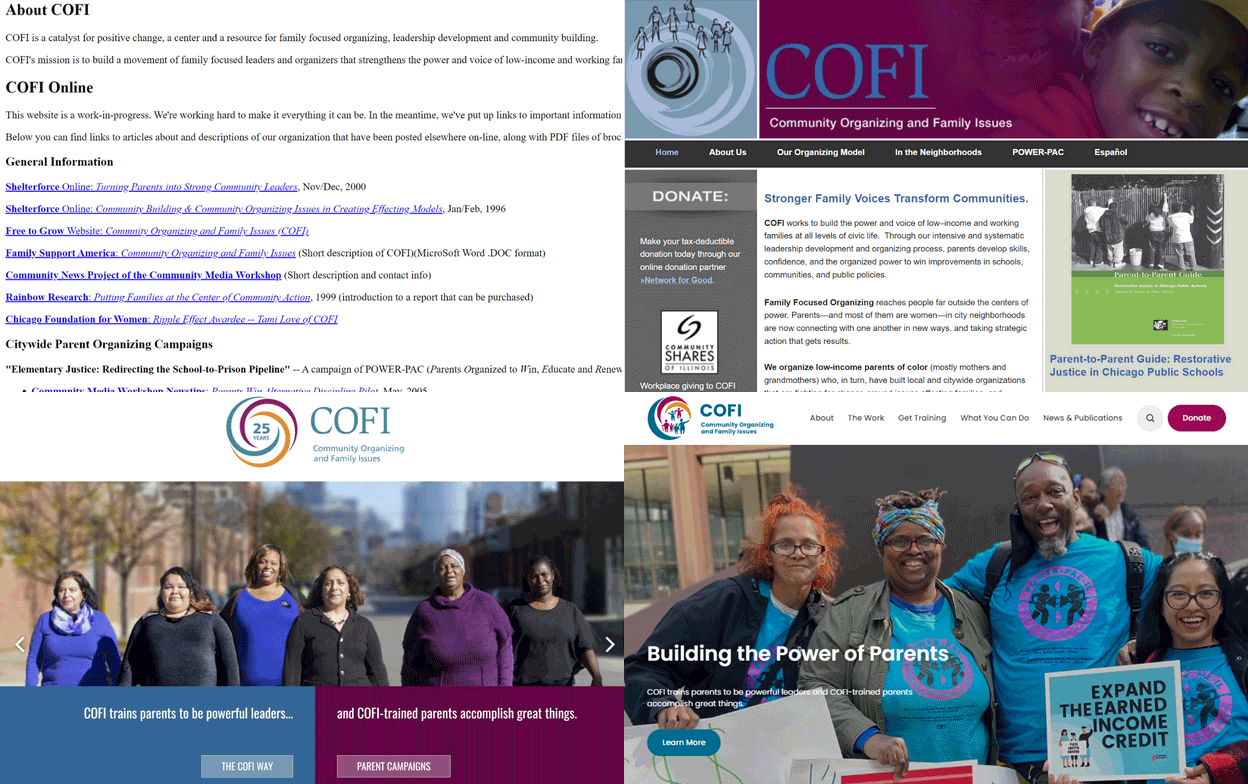
Last but not least, to help show off our new look, we’ve also launched a brand new website!

COFI’s home on the web is now more user friendly, making it easier to navigate and find the information you need. We highlight compelling stories and photos of COFI parent leaders and their incredible work, with a fresh and modern look.
We’re eager to hear what you think, so let us know!

